Design Forces in Ekawada, Part 3
String figure books are great resources, but they can be incredibly frustrating, too. Even if you’ve never tried to use one, it’s not hard to imagine having a string looped around your fingers, trying to hold the book open with your knee, and then discovering that the next step wraps onto the next page. You somehow need to turn the page without dropping any strings, and without closing or dropping the book.
It is no surprise, then, that this became one of the design forces that drove Ekawada’s construction.

Now, given the constraints on the size of an iPhone screen, it isn’t feasible (in general) to display all of the steps for a figure in one screen, so there still needs to be some kind of “next page” operation. However, the touchscreen makes this much easier to do than with a physical book.
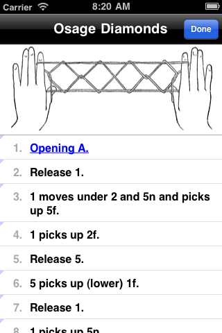
This screenshot shows the “figure detail” view. It gives you a nice big picture of what the final pattern will be, and then a sequential list of the steps to accomplish it. As you can see, the number of steps for “Osage Diamonds” (a.k.a. “Jacob’s Ladder”) exceeds the available screen real-estate, and so bleeds off the bottom. But that’s no problem on an iOS device, because you can simply swipe to scroll, and a swipe is much easier to do with strings on your fingers than trying to turn the page of a physical book.

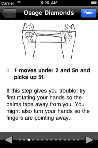
Further, if you tap any row in the instructions, you’ll be taken to a “zoomed” view. Here, each instruction is displayed full-screen, including any illustration or clarification for that step. (Not all steps have illustrations or clarifications, but for those that do, you’ll find them in this view.) You’ll also get an indicator of how much further you have to go to the end of the figure, and icons for going to the next (or previous) step.
Why icons? I considered doing a “swipe” gesture to go to the next page, but really, a tap is easier to do with strings on your hands than a swipe. (The less motion involved, the better.) I tried to strike a balance between size of the icons (a larger target is easier to hit) and maximizing the viewable area for the step (the less often you have to swipe to scroll a step instruction, the better). The size as it is now seemed best, empirically, but later versions may adjust the balance further.
This zoomed view also answers another one of the design forces behind Ekawada: “I don’t understand what this step is telling me to do.” You don’t want to just add verbosity to the instructions, because more verbosity can actually hurt readabilty. (Just try reading these instructions for the “Apache Door” figure, if you want a concrete example of what I mean.)
Thus, for steps where the instruction itself may be too terse, or ambiguous, I can use the zoomed view to add an illustration, or extra clarification, without bloating the instruction list. When you need more information, you can get at it easily, but for the common case, you can just scan the instruction list.
Tune in next time, when I’ll address another design force behind Ekawada: “I remember learning this one figure as a kid, but can’t remember how to do it now.”


Reader Comments
Hey, just one thought, on your zoomed in view, just make tapping anywhere on the instructions goto the next instruction. Going forward is what most people will do anyways, so why not make it easier.
Anyways, looking forward to this app for my daughter.
Cheers.
1 Nov 2010
Good idea, Trevor! It’s a little more complicated, because the instructions can include hyperlinks that take you to other figures, but it’s something I’ll look into post-v1.
1 Nov 2010
The obvious solution for this seems to be voice control.
Wouldn’t have to be very refined – basically supporting something like “next” (and “back”?), and it would only have to respond to those when in “hands-free mode”, not all the time, so there shouldn’t be a lot of noise.
No idea what APIs and libs are available.
1 Nov 2010
Mahalo for using ISFA notation. I’m afraid that mizz notations are not something that I have mastered.
1 Nov 2010
@Henrik, I agree that voice control would be nice, and I’m adding it to my list of things to consider.
1 Nov 2010
@Lois, mizz code is definitely an advanced notation. It’s super useful once you wrap your mind around it, but that’s always the trick, isn’t it? :) if I do add it to Ekawada down the road, it’ll always be optional; ISFA notation will be the default.
1 Nov 2010
I think it would improve the figures if you color the fingers holding the string, especially since the figures are to be viewed on a small screen.
4 Nov 2010
@Sebi, that’s a fair point. I’ll think about that and see how that could be made to work.
4 Nov 2010
Or maybe take advantage of the platform and put in animated gifs instead of pictures. That would be really cool.
4 Nov 2010