A look inside Ekawada's design
Around the time I was thinking of doing a native iOS app for cataloging string figures, my co-worker (and master designer) Ryan Singer posted this article and video about “designing with forces”. My take-away from it was that you don’t design with a list of desired features in mind, but instead with a list of focused scenarios that describe barriers that you want your application to overcome. These barriers are “forces” that are acting on the space your solution ought to fit into.
Taking one concrete example in Ekawada, I could imagine someone downloading the app and thinking, “I want to learn a figure that looks cool.” I wanted Ekawada to be able to address that user’s goal, and so this goal became one of the “forces” that the app needed to interact with.
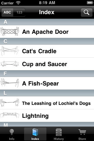
My next step was to consider ways that Ekawada could “balance” that force, pushing back usefully on the “what looks cool” question. It was obvious that in order for a user to know if a figure looked cool, they had to be able to see it, so I knew right away that I needed the illustrations of each figure to feature prominantly in the figure list.

The result is the index screen. The thumbnails are small, but I’ve found that they are sufficiently large to give a good impression of what the final figure will look like. I originally had a second view, with images that were 4x as large, which was intended to let you browse the figures by their illustrations. I took a couple of weeks to build it out, and learned a bunch about subclassing and customizing UITableView. Alas, it was a darling I had to kill, though I may bring it back eventually (once in git, always in git, eh?). It turned out that the view was not really much more useful than the index itself, and removing it helped to simplify the UI a bit.
All told, my original list of “forces” included nine different questions and scenarios that I wanted Ekawada to be able to answer, and for this first version I believe I’ve been able to address at least eight of them. I may do some more posts about those other design forces and how I tackled them, so watch this space.
Ekawada approaches—last night I was able to knock off a few more items from my to-do list (and, well, add one or two more items to it), and I’m really excited about how it is coming. I don’t want to give a release date or anything yet, but my list of remaining issues is only about seven items long, none of which should take more than 30-60 minutes to complete. Almost done!


Reader Comments
Looking forward to the release! It seems such a shame I’ve already forgotten most of what you taught me; it will be nice to have a little pocket-sized reference.
27 Oct 2010
The “pocket-sized reference” angle is the biggest reason I’ve been working on this, because I’ve wanted one, too. :) Even if no one else has any interest in it, Ekawada will be all I wanted simply because I’m writing it for me.
27 Oct 2010
Looks great, Jamis! I think it’s awesome you can create stuff like that.
27 Oct 2010